Making hex stickers for your creations
February 13, 2025
For some reason, hexagonal ‘stickers’ or logos have become synonymous with a lot of open source software, packages and projects with some people plastering their laptops with them until it looks like a pub bathroom wall. Maybe it’s because they fit neatly together or make us feel like part of a community or maybe it’s just our nerdy version of a signet ring. Either way, here’s how to make one for your projects to deceive everyone into thinking your project is legit.
What you’ll need:
- A half-cooked project you’re procrastinating on
- R studio
- The very handy
hexStickerpackage
1. Install and load the hexSticker package
install.packages("hexSticker")
library(hexSticker)
This package does all the heavy lifting for you so creds to Guangchuang YU.
2. Get creative
We can design these hex logos with any plot or image along with a title of your choosing. Now this is probably the part that a lot of us ’numbers-people’ struggle with so instead of just smashing in some horrendous grey and black base R plot, I recommend thinking about what your project does and what colours will draw people to it. I’m a personal fan of minimal/simple designs but go crazy if you want.
I want the colours to gel with the ones on my website so I like to use free online colour tools like this one to find those harmonious colours that work.
Starting with plots, lets create something simple yet striking to include. We’re feeling cheery so as an example we’ll just use the built-in mdeaths dataset which details monthly deaths from lung diseases in the UK over 6 years.
First we’ll just tidy up our data into a format we can plot:
library(tidyverse)

df <- data.frame(.preformat.ts(datasets::mdeaths), stringsAsFactors = FALSE) |>
  pivot_longer(cols = everything(), names_to = "Month", values_to = "Deaths") |>
  mutate(Deaths = as.numeric(Deaths)) |>
  group_by(Month) |>
  summarise(Deaths = sum(Deaths))
Then we’ll just make sure the months are in order:
df$Month <- factor(df$Month, levels=month.abb)
Let’s plot it just highlighting a random month and see what it looks like…
p <- ggplot(aes(x = Month, y = Deaths), data = df) +
  geom_col(fill = ifelse(df$Month == "Mar", "#685080", "grey"))

p
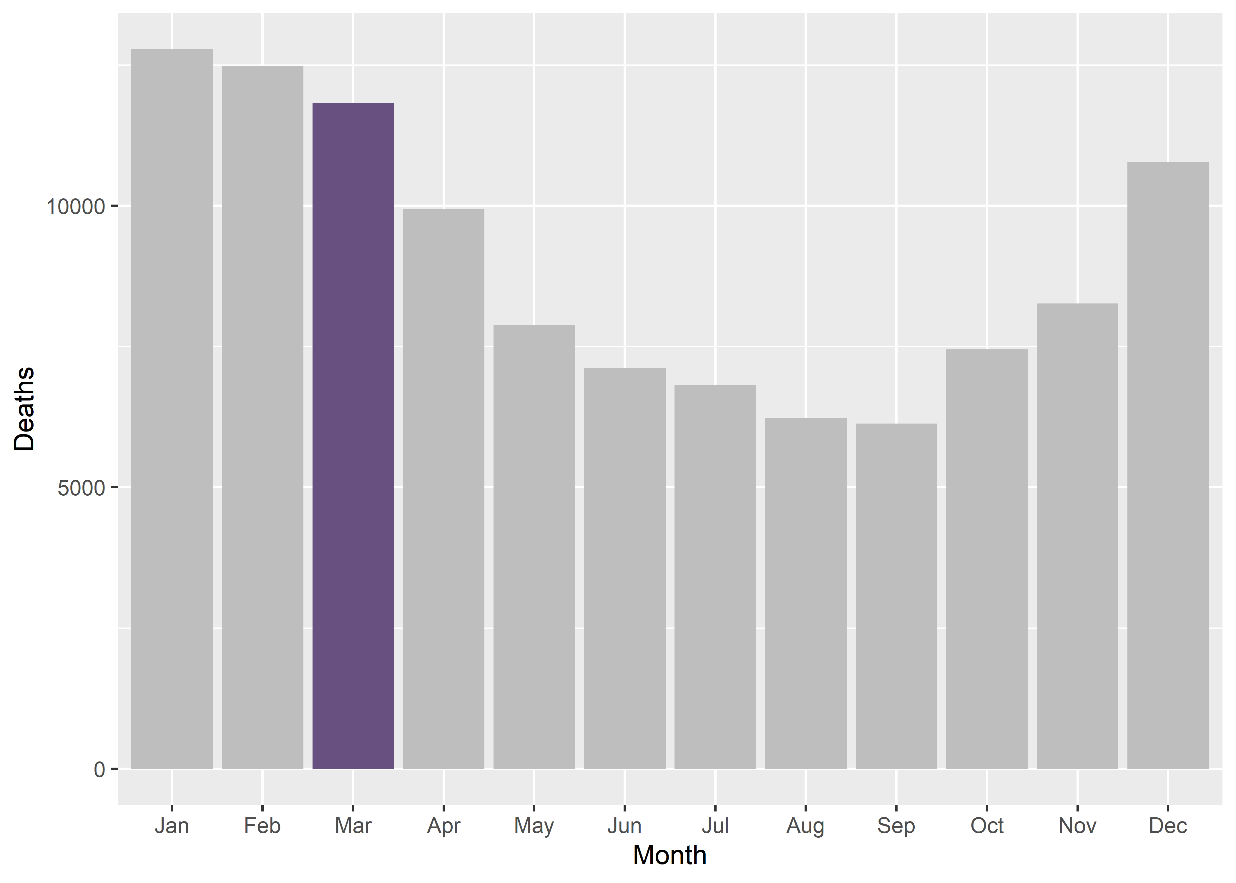
So visually it’s a bit of a mess with the default grey background but the highlighted colour stands out which is good so let’s just strip the plot of everything including the legend so we can just see the bars:
p <- p +
  theme_void() +
  theme_transparent() +
  theme(legend.position="none")
Instead of plots, we could also include images so I’ll just use this rather generic copyright free png icon but you get the idea:

3. Bringing it all together
So now we can use the sticker function from the hexSticker package to generate a hex logo using our plot or image and customise it in all sorts of ways. We can customise the title text, the border and fill colours as well as adding a spotlight effect if you fancy; this is simply detailed in the concise help file for the package accessed by ?hexSticke::sticker() in your R console. Let’s take a look at what our hex logo looks like with our plot:
sticker(p, package="mDeaths", p_color = "#685080", p_x= 1, p_y = .5, p_size=20,
        s_x=1, s_y=1.1, s_width=1.3, s_height=1,
        h_fill = "white", h_color = "black",
        spotlight = TRUE,
        filename="img/hex_plot.png", dpi = 240)

And with our image:
sticker(imgurl, package="mDeaths", p_color = "white", p_size=20,
        s_x=1, s_y=.75, s_width=.6,
        h_fill = "#685080", h_color = "black",
        filename="img/hex_image.png", dpi = 240)

4. Celebrate
And that’s literally all there is to it; now you can start pinning this logo all over your Github so people know you’re the real deal.
- Posted on:
- February 13, 2025
- Length:
- 3 minute read, 606 words
- See Also: